Smart lighting picks colors, sets brightness and switches scenes through an app. But have you ever thought about how a red-green color-blind user, facing a full color wheel, is supposed to tell whether what they picked is red or green? When a lighting interface hands the whole job of 'picking a color' to color itself, a group of people is shut out. Accessible design is not a charitable bonus—it is building the product for everyone who pays for it. This piece is about inclusive design for lighting apps.
- Accessibility isn’t charity—it’s the market
- WCAG: the universal accessibility benchmark
- Don’t rely on color alone: the core problem of the color picker
- Contrast and type size: balancing mood and legibility
- Human-centred: putting the user into the whole process
- From hardware to experience: the PowerMOS role in inclusive control
- References and standards
- FAQ
Much of the smart-lighting experience is handed to an app: picking colors, setting brightness, switching scenes, scheduling. How well that interface is built directly decides how usable the product is.
But usable for whom? Picture a red-green color-blind user facing a full color wheel in the app—how are they supposed to tell whether what they picked is red or green? When the interface stakes the whole job of ‘picking a color’ on color itself, a whole group of people is quietly shut out. Accessible design, at bottom, is building the product for everyone who pays for it.
Accessibility isn’t charity—it’s the market
First, dispel a misconception: accessibility is often treated as ‘goodwill toward a minority.’ But color-vision deficiency is remarkably common among men, and add to that people with low vision, older users, and everyone squinting at a phone in bright sunlight—accessible design serves a far broader set of users than you would think.
For smart-lighting brands going global, this matters even more: expectations and legal requirements around accessibility are rising in European and American markets, and an app with accessibility built in is a mark of product professionalism and market access, not an optional decoration.
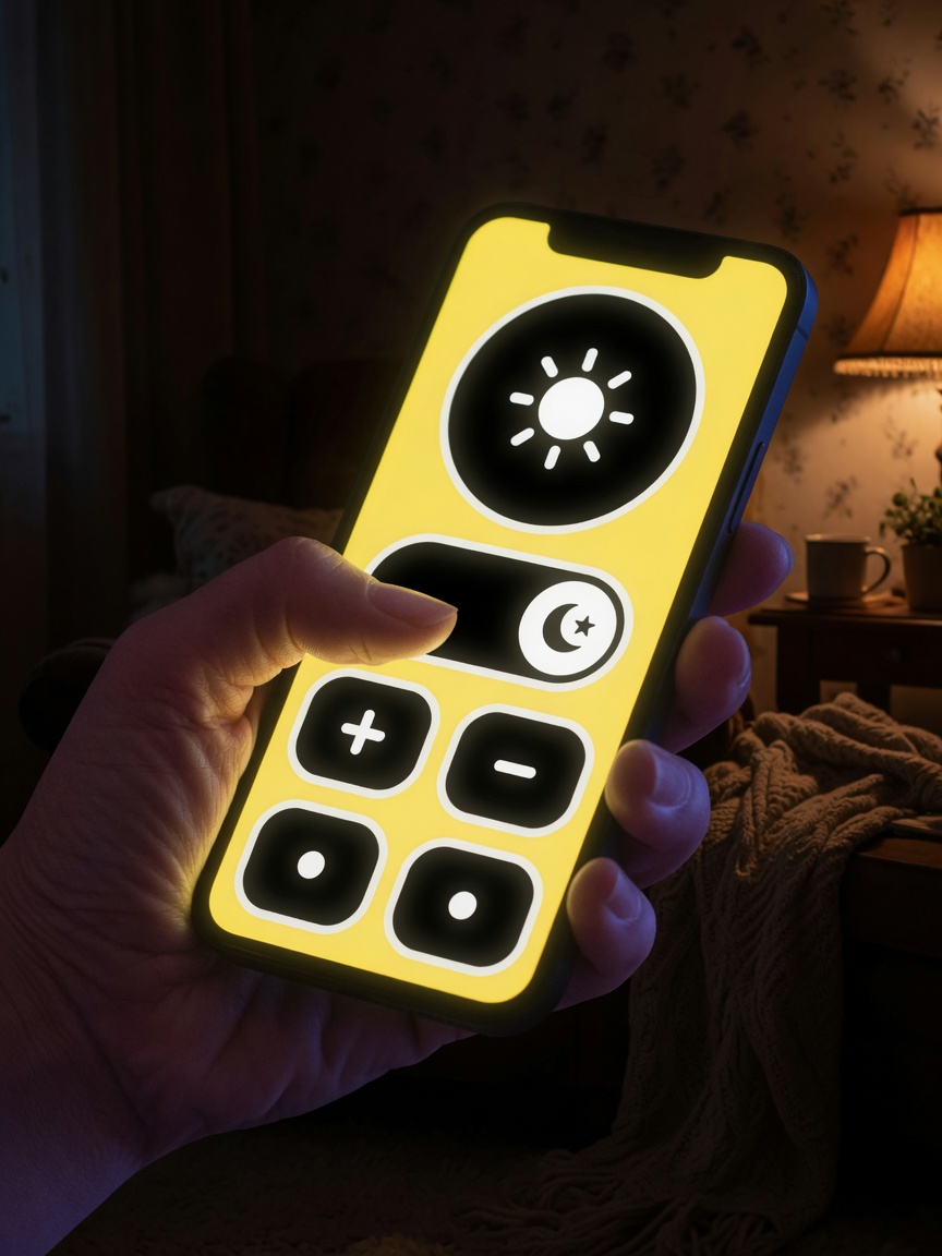
WCAG: the universal accessibility benchmark
You cannot talk about accessibility without WCAG (Web Content Accessibility Guidelines). Developed by the W3C, it is the globally recognized benchmark, and although named for ‘web,’ its principles apply equally to app interfaces.
The latest, WCAG 2.2, became a W3C Recommendation on 5 October 2023[1], adding 9 success criteria on top of 2.1—covering keyboard focus, dragging actions, minimum target size, consistent help, and more. For a lighting app where a finger has to drag sliders and tap color swatches precisely on a small screen, these criteria hit very close to home.
Don’t rely on color alone: the core problem of the color picker
WCAG has a criterion that looks simple yet points straight at the heart of a lighting app—1.4.1 Use of Color: color must not be the only means of conveying information[1].
This criterion cuts especially sharp for a lighting app, because picking a color is itself done by color. The fix is not to remove the color wheel, but to add support that doesn’t depend on color:
- Show the color name, HEX value or color temperature (K value) at the same time, so users can confirm their choice by text
- Use distinguishable icons and patterns rather than color swatches alone to differentiate states (for example, ‘on/off’ shouldn’t rely only on red and green)
- Provide text labels for preset scenes (‘Warm White,’ ‘Party’) rather than just a row of color cards
That way, a red-green color-blind user, too, can know exactly what they picked.
Contrast and type size: balancing mood and legibility
Lighting apps often use dark backgrounds to set a mood—beautiful, but it plants an accessibility trap: light text with insufficient contrast against the background becomes hard to read for people with low vision and older users.
WCAG’s 1.4.3 Contrast (Minimum) (level AA) gives a clear threshold: at least 4.5:1 for ordinary body text, and at least 3:1 for large text (about 18pt, or 14pt bold and above)[1]. Paired with adequate type size and a scalable layout, you can have both mood and legibility—a dark background isn’t off-limits, it just has to be used responsibly.
Human-centred: putting the user into the whole process
Beyond tools and thresholds, there is methodology. ISO 9241-210 defines human-centred design for interactive systems, emphasizing understanding real users, their needs and their contexts of use, and approaching usability through iterative design and evaluation[2].
Its spirit is this: accessibility is not an ‘acceptance gate’ where you find people to test after the product is done, but a matter of putting diverse users into the whole lifecycle from the start. It matters especially for products going global—languages, habits and abilities differ widely across markets, and designing on the team’s own intuition alone easily misses an entire group of people.
From hardware to experience: the PowerMOS role in inclusive control
An accessible lighting experience doesn’t live only at the app layer. A ‘soft, predictable, non-jarring’ lighting response needs a foundation of sufficiently refined and stable control capability underneath.
PowerMOS pixel-control ICs offer high grayscale depth and a constant-current architecture, letting the app make smooth, step-free transitions in the brightness and color of every LED—precisely the hardware foundation on which inclusive design touches like ‘soft gradients’ and ‘predictable response’ can land. Paired with flicker-free dimming, it is also gentler on light-sensitive users. The interface states the information clearly, the hardware controls the light steadily and finely—together, the two layers make a lighting experience that is genuinely usable. See the full model range and specifications at the product center.
Further reading: for the engineering of flicker-free dimming, see The Grayscale, Color and Flicker-Free Dimming Engineering of Addressable LEDs; for the smart-lighting protocol ecosystem, see Bringing Christmas Lights into the Smart Home: Integrating Matter, Zigbee and Wi-Fi Lighting Control.
References and standards
- WCAG 2.2, Web Content Accessibility Guidelines (WCAG) 2.2. W3C Recommendation, 5 October 2023. World Wide Web Consortium (W3C).
- ISO 9241-210:2019, Ergonomics of human-system interaction — Part 210: Human-centred design for interactive systems. International Organization for Standardization (ISO).
This article is an educational piece on accessible design. The names of the cited standards can be verified in the official catalogs of the W3C and ISO. PowerMOS pixel-control ICs use a proprietary carrier protocol optimized for LED pixel control.
FAQ
What is WCAG, and what's new in version 2.2?
WCAG is the Web Content Accessibility Guidelines, developed by the W3C, the globally recognized accessibility benchmark that also applies to app interface design. WCAG 2.2 became a W3C Recommendation on 5 October 2023, adding 9 success criteria on top of 2.1—covering keyboard focus, dragging actions, minimum target size, consistent help, and more—to make things easier for people with visual, physical and cognitive disabilities.
Why is 'don't rely on color alone' especially important for lighting apps?
WCAG success criterion 1.4.1 (Use of Color) requires that color not be the only means of conveying information. This cuts sharply for a lighting app, because picking a color is itself done by color. A considerable proportion of men have some color-vision deficiency, and a red-green color-blind user struggles to distinguish pure hues on a wheel. The fix is to also provide text or numeric labels (color name, HEX, color-temperature K value), distinguishable icons and patterns, so the app can be operated without relying on color.
Why are contrast and type size part of accessibility?
WCAG success criterion 1.4.3 (Contrast Minimum, level AA) requires a contrast of at least 4.5:1 between ordinary body text and its background, and at least 3:1 for large text (about 18pt, or 14pt bold and above). Lighting apps often use dark backgrounds to set a mood, and light text with insufficient contrast then becomes hard to read—especially for people with low vision or older users. Paired with adequate type size and a scalable design, information stays legible across lighting conditions and vision levels.
Is 'human-centred design' a process or a slogan?
It is an operable process. ISO 9241-210 defines human-centred design for interactive systems, emphasizing understanding real users, their needs and their contexts of use, and approaching usability through iterative design and evaluation. It is not about finding a few people to test after the product is done, but about placing users into the whole lifecycle. It matters especially for products going global, because users' habits, languages and abilities differ widely across markets.
How does the PowerMOS solution support the app in delivering refined, inclusive lighting control?
An accessible lighting experience needs a foundation of sufficiently refined, stable control capability underneath. PowerMOS pixel-control ICs offer high grayscale depth and a constant-current architecture, letting the app make smooth, step-free adjustments to the brightness and color of every LED—which is what makes inclusive design touches like 'soft transitions' and 'predictable response' possible. Paired with flicker-free dimming, it is also gentler on light-sensitive users. See the product center for the full model range.
Upgrading your string lights to full pixel control?
Power MOS Electronics delivers the complete stack — driver ICs, addressing equipment, controllers and apps. Tell us about your product and our engineering team will spec it with you.
Contact PowerMOS Browse products